
下面总结了一些常用又有趣的css技巧,希望大家收藏,以减少查资料的时间。
三角形
最常见的一种形状了。切图,不存在的。
/** 正三角 */
.triangle {
  width: 0;
  height: 0;
  border-style: solid;
  border-width: 0 25px 40px 25px;
  border-color: transparent transparent rgb(245, 129, 127) transparent;
}
/** 倒三角 */
.triangle {
  width: 0;
  height: 0;
  border-style: solid;
  border-width: 40px 25px 0 25px;
  border-color:  rgb(245, 129, 127) transparent transparent transparent;
}
虚线效果
.dotted-line{
    border: 1px dashed transparent;
    background: linear-gradient(white,white) padding-box, repeating-linear-gradient(-45deg,#ccc 0, #ccc .25em,white 0,white .75em);
}
css自带的border-style属性 dotted/ dashed . 效果展示出来太密了,并不符合UI设计
具体的虚线的颜色和间距都可以通过repeating-linear-gradient生成的条纹背景去调整。
文本超出省略号
单行文本

.single-ellipsis{
  width: 500px;
  overflow: hidden;
  text-overflow: ellipsis;
  white-space: nowrap;
}
多行文本
.multiline-ellipsis {
  display: -webkit-box;
  word-break: break-all;
  -webkit-box-orient: vertical;
  -webkit-line-clamp: 4; //需要显示的行数
  overflow: hidden;
  text-overflow: ellipsis;
}
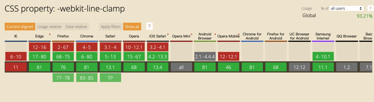
扩展: -webkit-line-clamp 是一个 不规范的属性(unsupported WebKit property),它没有出现在 CSS 规范草案中。
为了实现该效果,它需要组合其他外来的WebKit属性。常见结合属性:
- display: -webkit-box; 必须结合的属性 ,将对象作为弹性伸缩盒子模型显示 。
- -webkit-box-orient 必须结合的属性 ,设置或检索伸缩盒对象的子元素的排列方式 。
- text-overflow,可以用来多行文本的情况下,用省略号“...”隐藏超出范围的文本 。
浏览器兼容性:
时间轴

html结构
<div class="timeline-content">
  <div v-for='(item, index) in timeLine' :key='index' class="time-line">
    <div :class="`state-${item.state} state-icon`"></div>
    <div class="timeline-title">{{item.title}}</div>
  </div>
</div>
css样式
/** 时间轴 */
.timeline-content{
  display: flex;
  .time-line{
    padding: 10px 10px 10px 20px;
    position: relative;
    &::before{
      content: '';
      height: 1px;
      width: calc(100% - 34px);
      background: #EBEBEB;
      position: absolute;
      left: 24px;
      top: 0;
    }
  }
  .state-icon{
    width: 20px;
    height: 20px;
    position: absolute;
    top: -12px;
    left: 0;
  }
  .state-1{
    background: url('https://static.daojia.com/assets/project/tosimple-pic/fen-zu-7-copy-6bei-fen_1589266208621.png') no-repeat;
    background-size: cover;
  }
  .state-2{
    background: url('https://static.daojia.com/assets/project/tosimple-pic/12_1589266226040.png') no-repeat;
    background-size: cover;
  }
  .state-3{
    background: url('https://static.daojia.com/assets/project/tosimple-pic/fen-zu-7-copy-3_1589266140087.png') no-repeat;
    background-size: cover;
  }
}
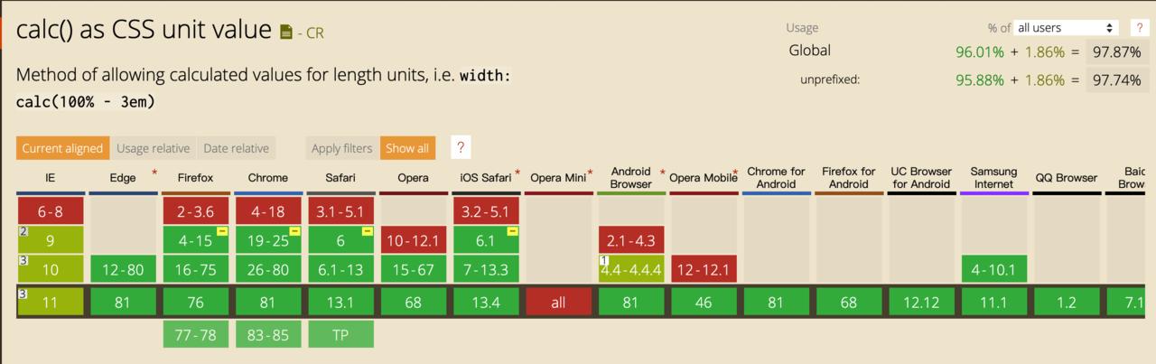
calc()函数 用来计算css属性的值。
用法:
注意: +和-运算符在运算符和值之间需要一个空格。例如,它将被calc(50% -8px)解释为百分比,后跟负像素长度。只有在-到8px之间有空格时,才可以正确减法:calc(50% - 8px)
空格在乘法或除法中不起作用,但建议阅读时要注意。
除了减法,还可以用 +(加) ,/(除) , *(乘)。但要注意的是:
注意: +和-运算符在运算符和值之间需要一个空格。例如,它将被calc(50% -8px)解释为百分比,后跟负像素长度。只有在-到8px之间有空格时,才可以正确减法:calc(50% - 8px)
空格在乘法或除法中不起作用,但建议阅读时要注意。
浏览器兼容性:
滚动条
.scroll-container {
 height: 250px;
 border: 1px solid #ddd;
 padding: 15px;
 overflow: auto;
 .row {
   margin: 0;
   line-height: 1.5;
 }

 &::-webkit-scrollbar {
   width: 8px;
   background: white;
 }
 &::-webkit-scrollbar-corner, /* 滚动条角落 */
 &::-webkit-scrollbar-thumb,
 &::-webkit-scrollbar-track {
   border-radius: 4px;
 }
 &::-webkit-scrollbar-corner,
 &::-webkit-scrollbar-track {
   /* 滚动条轨道 */
   background-color: rgba(180, 160, 120, 0.1);
   box-shadow: inset 0 0 1px rgba(180, 160, 120, 0.5);
 }
 &::-webkit-scrollbar-thumb {
   /* 滚动条手柄 */
   background-color: #00adb5;
 }
}
卡券效果
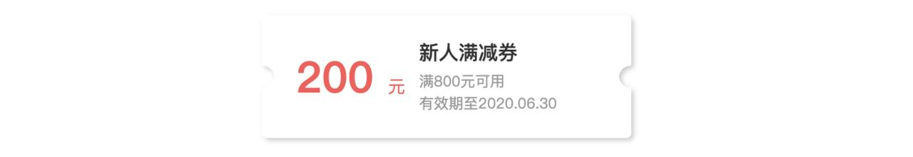
.coupon{
  width: 300px;
  height: 100px;
  position: relative;
  background: radial-gradient(circle at right bottom, transparent 10px, #ffffff 0) top right /50% 51px no-repeat,
    radial-gradient(circle at left bottom, transparent 10px, #ffffff 0) top left / 50% 51px no-repeat,
    radial-gradient(circle at right top, transparent 10px, #ffffff 0) bottom right / 50% 51px no-repeat,
    radial-gradient(circle at left top, transparent 10px, #ffffff 0) bottom left / 50% 51px no-repeat;
  filter: drop-shadow(2px 2px 2px rgba(0,0,0,.2));
}
阴影效果
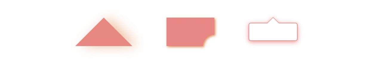
// 三角形阴影
.shadow-triangle{
    width: 0;
    height: 0;
    border-style: solid;
    border-width: 0 50px 50px 50px;
    border-color: transparent transparent rgb(245, 129, 127) transparent;
    filter:drop-shadow(10px 0px 10px  rgba(238, 125, 55,0.5));
}

// 缺圆投影
.circle-square{
    width:100px;
    height:50px;
    line-height: 50px;
    background: radial-gradient(circle at bottom right, transparent 20px, rgb(245, 129, 127) 15px);
    filter: drop-shadow(2px 2px 2px rgba(238, 132, 66, 0.9));
}

// 气泡阴影
.tip {
    width: 100px;
    height: 30px;
    line-height: 30px;
    border: 1px solid rgb(245, 129, 127);
    border-radius: 4px;
    position: relative;
    background-color: #fff;
    filter: drop-shadow(0px 2px 4px rgba(245, 129, 127, 0.9));
    &::before {
      content: "";
      width: 0;
      height: 0;
      border-style: solid;
      border-width: 0 10px 10px 10px;
      border-color: transparent transparent #fff transparent;
      position: absolute;
      top: -10px;
      left: 0;
      right: 0;
      margin: auto;
      z-index: 2;
    }
    &::after {
      content: "";
      width: 0;
      height: 0;
      border-style: solid;
      border-width: 0 10px 10px 10px;
      border-color: transparent transparent rgb(245, 129, 127) transparent;
      position: absolute;
      top: -11px;
      left: 0;
      right: 0;
      margin: auto;
      z-index: 1;
    }
}
等高布局
没有什么是一个flex搞不定的。
.parent{
    display: flex;
 }
如果一行放不下,可以折行。
.parent{
  flex-wrap: wrap;
}
总结
上面是一些静态的样式,还有一些更好玩的动态样式,希望有机会与大家分享~ 如果你有更多css的有趣技巧,欢迎在评论区留言哦~